The brand name emerged from the concept of sharpness; monikers built around tight, high-frequency phonemes. I, K, X. Clarity made audible. And visually, IXI was already hiding in the original company name, Pixieray. We drew it out, gave it space, and saw what it could become.
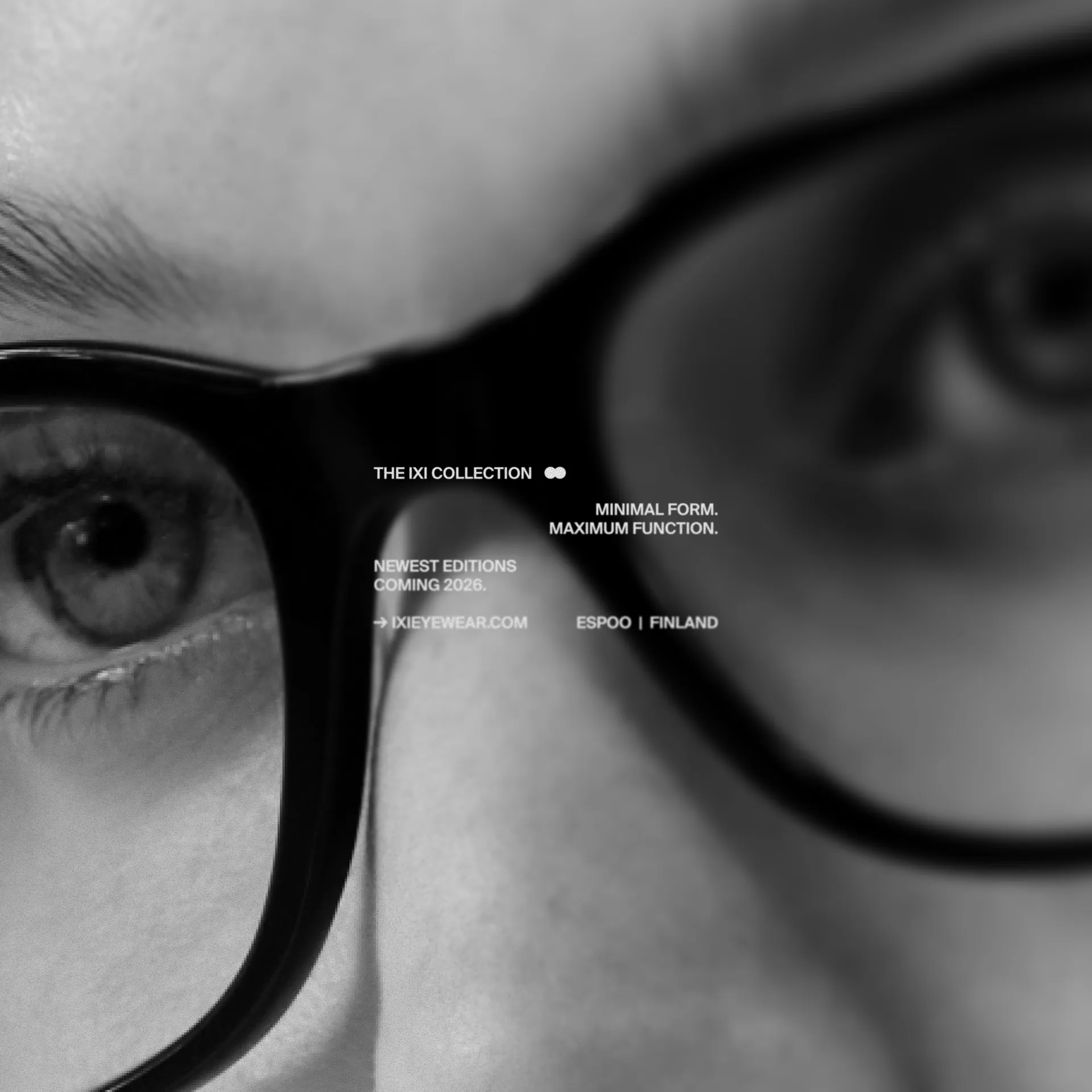
Short, sharp, and memorable, in the capitals we selected for the logo, it resembles an infinity symbol. Or an X framed by two brackets. This forms a visual metaphor for the product itself: a frame that delivers limitless, focused vision.

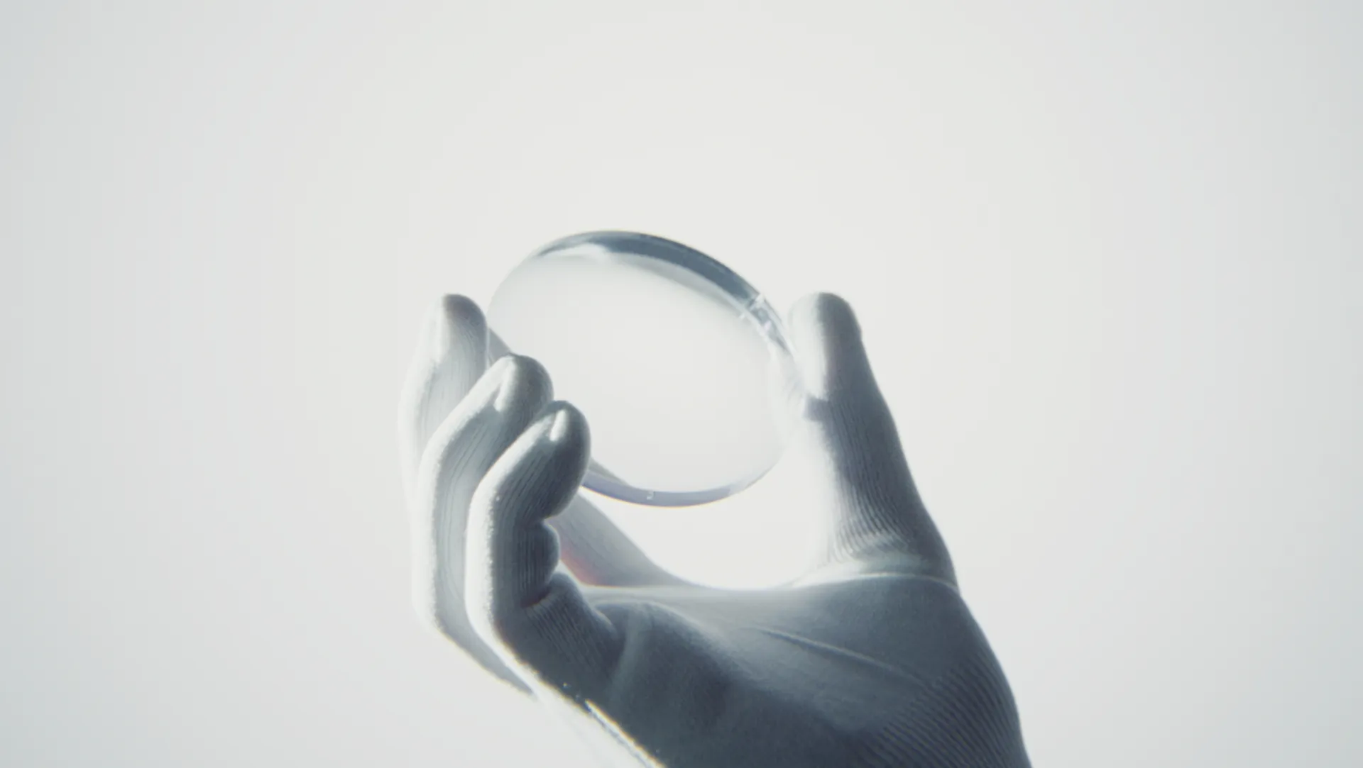
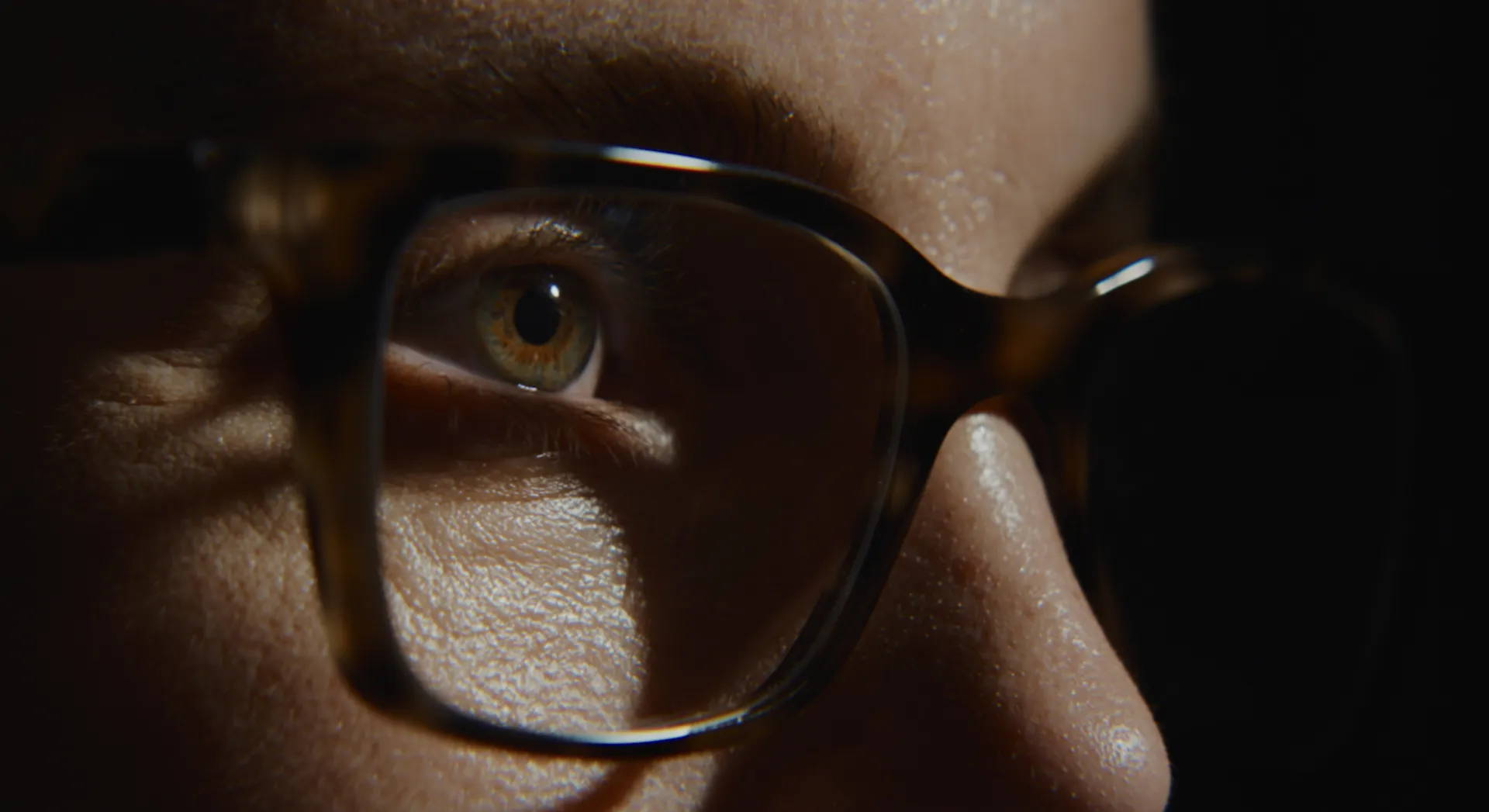
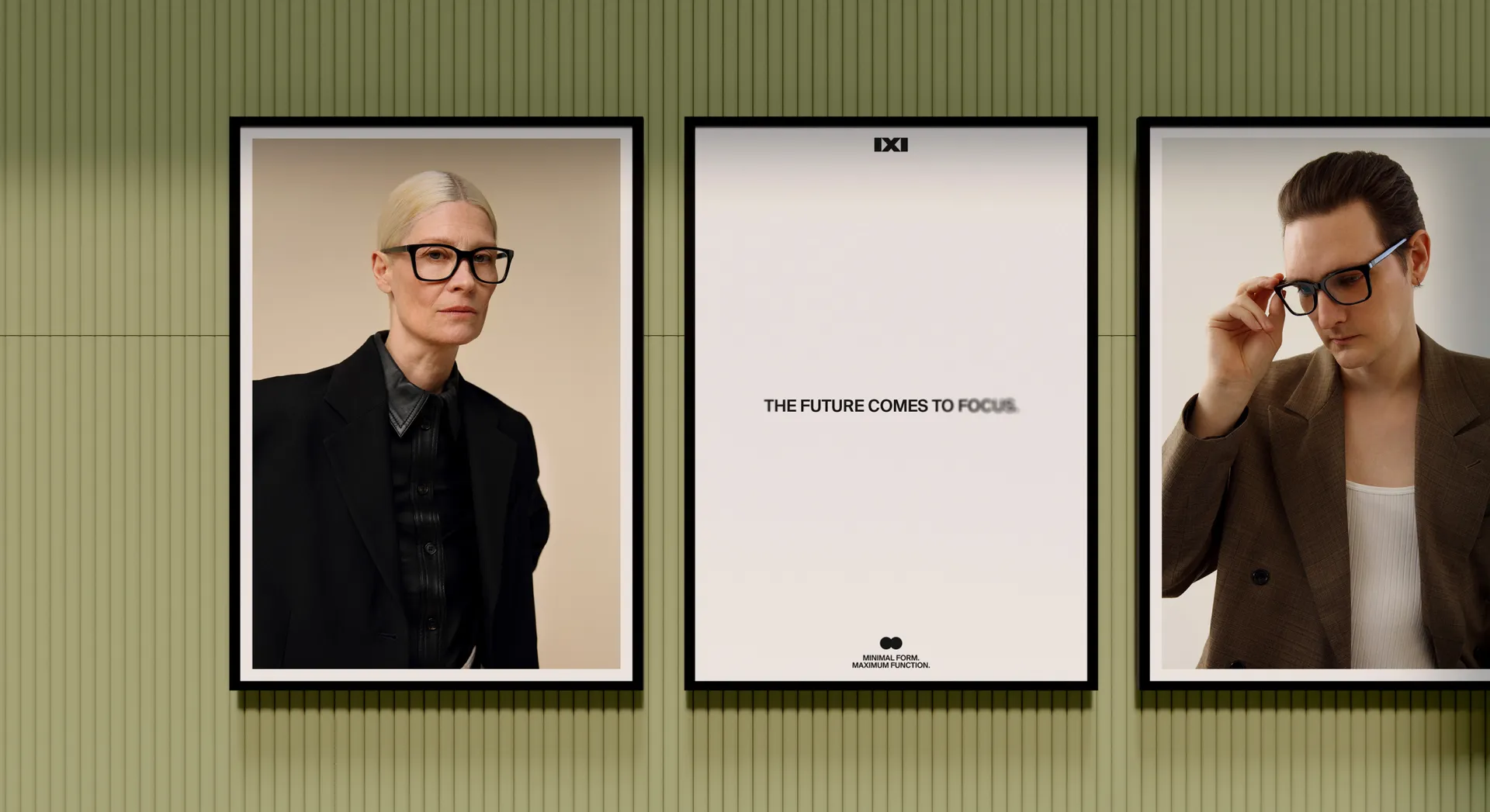
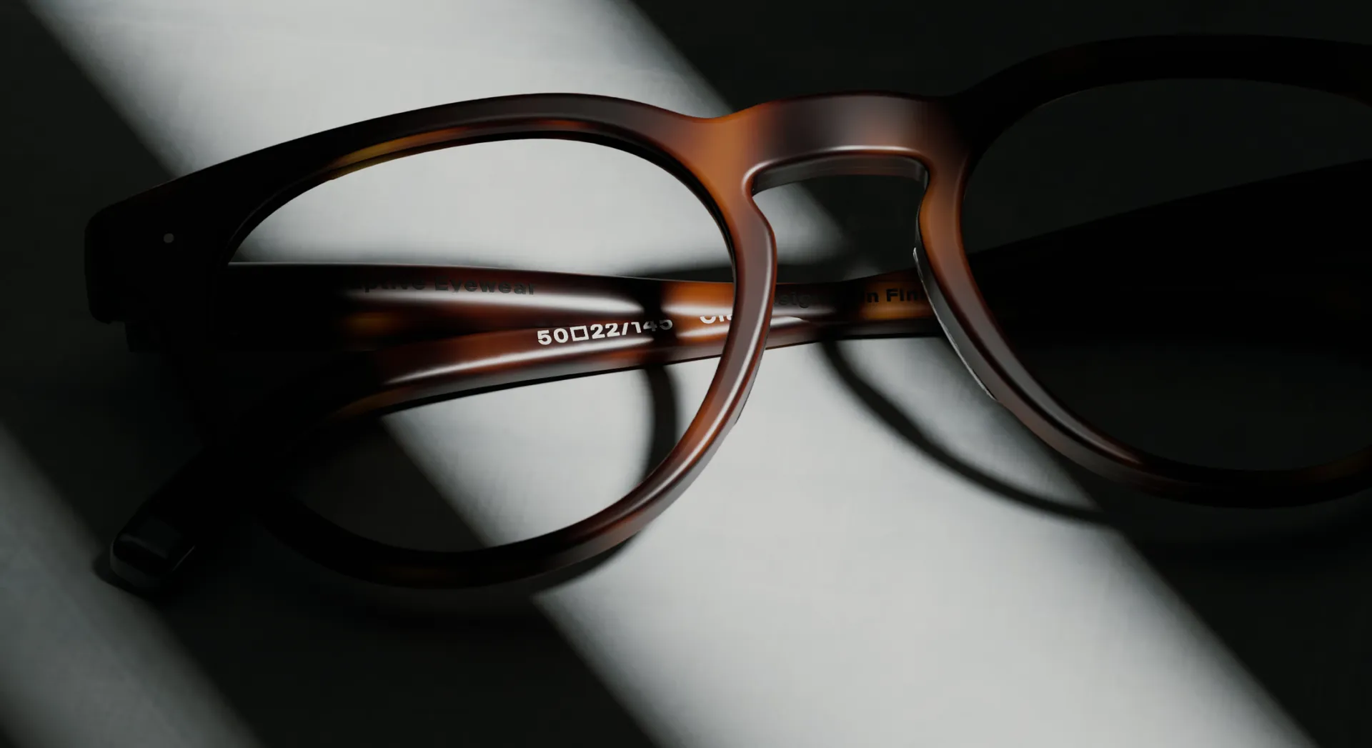
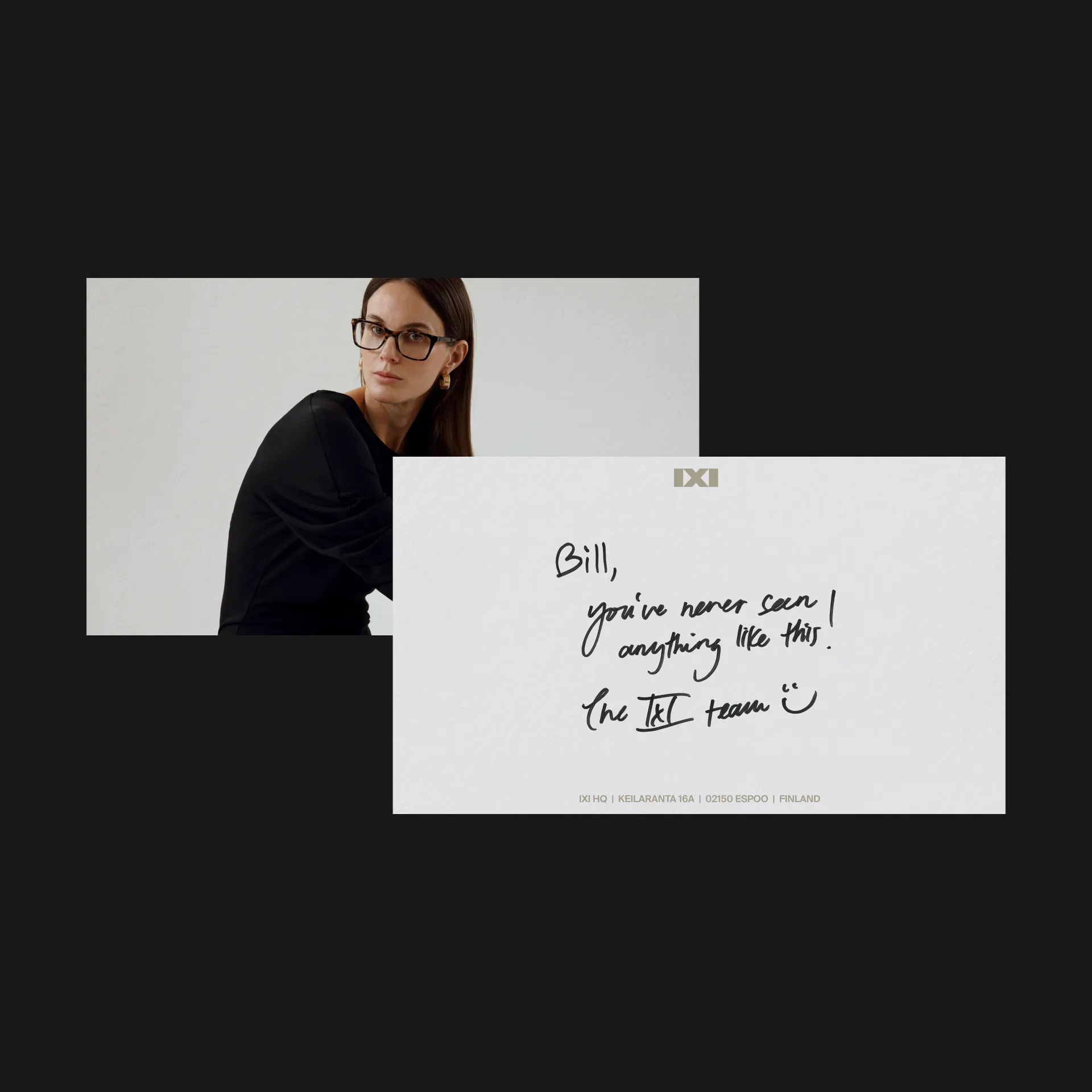
With limitless sight at the focus of IXI’s work, the brand needed a library of still and moving images that would reaffirm sight’s importance as a source of joy and inspiration. But no matter how radical an improvement to vision, to be the most worn wearable, IXI’s glasses must look as good as the world appears through them. We partnered with Karoliina Barlund — photographer for Vogue Scandinavia — to organise a shoot that would give IXI a firm footing in the fashion space. This allowed a reach beyond the confines of the tech bubble and wearable enthusiasts, into mainstream attention.
Footage from this shoot was the conclusion to the brand film: the end point of years of pushing scientific limits, which the film’s beginnings capture. Directing duo Oldie shot and produced all moving image. Spending days in IXI’s labs, they immortalised the technological leap that has been the engineering journey beyond binary sight adjustment.
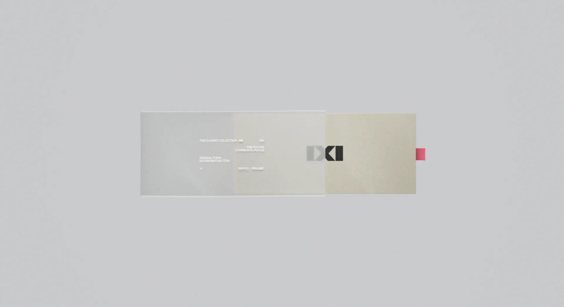
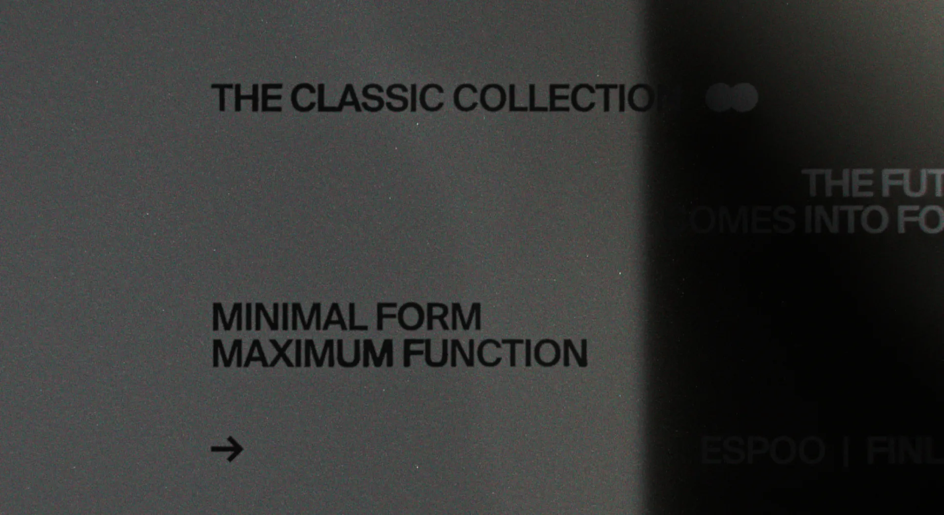
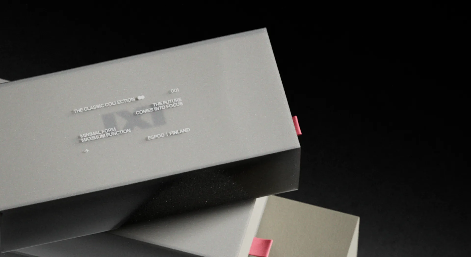


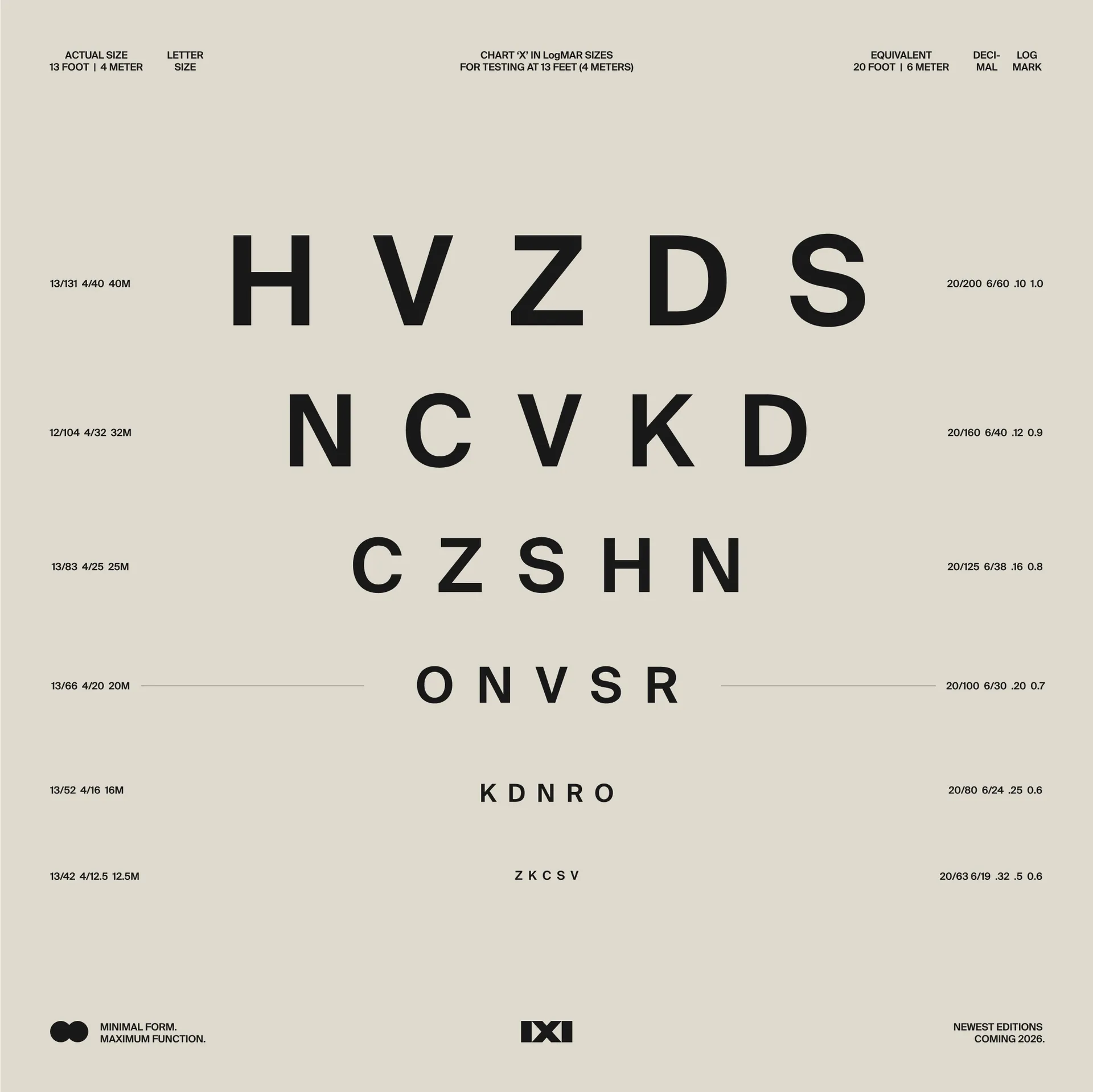
This imagery and the logo are the heroes of the brand: elsewhere, the colours and typography embody subtlety, class and elegance. The palette is largely monochromatic with hints of muted colour; the overall impression is one of professionalism and trustworthiness. The utilitarian grotesk Suisse typeface allows for the presentation of information objectively with precision.
Together, the assets come together to form a brand poised for expansion. IXI has been designed to be a global household name, and a historical landmark in the journey towards improving humanity’s vision.